Cover study
She Cuts the Rope
Drawn and annotated by August Ferry, Illustrator Published 30 July 2026
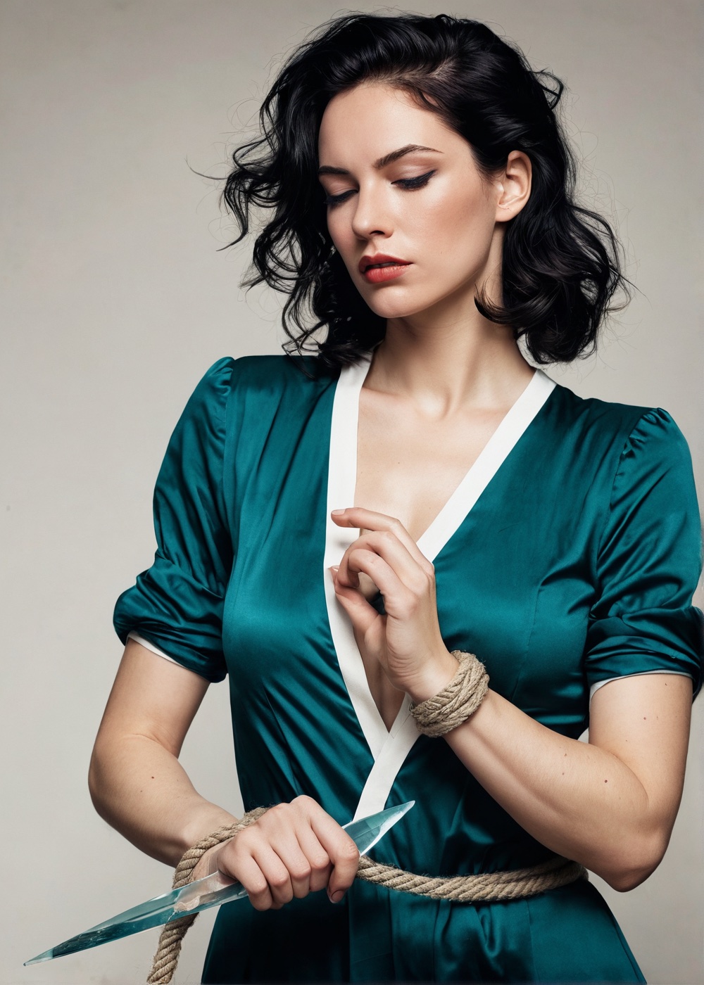
She Cuts the Rope In the manner of a modern indie comic cover
The same picture with the strongest line handed to the person in the rope.
- The strongest contour in the composition runs through her, from braced foot to the hand holding the glass.
- Her eyeline is on the rope, not on the reader and not on the threat. Concentration reads as a mind at work.
- The threat is small, soft and pushed into the upper left. Demoting the figure who traditionally owns that space is the argument.
- Contemporary working clothes, flat lighting, no rim light. Nothing in the frame is arranged for an outside viewer.
- One cold highlight on the cutting edge is the only saturated note, so the eye lands on the action rather than the body.
This one argues with the other two.
The setup is identical on paper. A woman, a rope, a threat somewhere in the frame. What changes is which element gets the dominant contour. Here the strongest line in the composition runs from her braced back foot through her hip and shoulder to the hand holding a shard of glass against the last turn of rope at her wrist. The rope is already parting. Everything else in the picture is subordinate to that line, including the threat.
Her costume is contemporary and unremarkable: work trousers, boots, a jacket that has had a bad night. She is not looking out of the frame at the reader and she is not looking at the danger either. She is looking at the rope, because that is the problem in front of her, and a character concentrating on a task is a character with a mind.
The threat is a figure in a doorway at the far end of a corridor, small, out of focus and pushed to the upper left corner. Traditionally he would own that space. Demoting him is the entire point.
Colour is muted and close in value except for one clean cold highlight on the glass edge, which is where the eye lands and where the story is. Flat lighting, no rim glamour, nothing arranged for anyone standing outside the picture.
The covers on this site are original studies made for it, drawn in the idiom of a period. They are not historical covers, no real publication is being reproduced, and they are attributed to no artist. Where a caption says a study is in the manner of a decade, that describes the look the picture imitates and nothing else.
Pictures record, people decide
Every arrangement in this study was worked out on paper. The real ones get worked out in conversation first.
See where it happens now